First-year university project · Two semesters
Whisk
A two-semester university project exploring how a mobile app could support more conscious eating, meal planning, shopping, and everyday cooking.
Exploring everyday eating habits
The project explored how people plan meals, shop for food, cook, manage leftovers, and make everyday eating decisions. The goal was to understand what gets in the way of more conscious eating and how a mobile product could support those routines.
The project ran across two semesters. The first focused on UX research and product structure as a team assignment, where I took the lead on most of the research, synthesis, and information architecture. In the second semester, the team separated and each of us independently explored a different UI direction for the same concept.
Understanding different eating routines
I explored how people approach conscious eating, meal planning, shopping, cooking, budgeting, and food waste. The research considered several potential user groups, including students, parents, active users, people following specific diets, and vegetarian or vegan users.
Turning patterns into user types
I created personas to represent different motivations, routines, constraints, and technology habits, then mapped key parts of the meal-planning and shopping journey to understand where digital support could be useful.
An early feature set
The research led to an early feature set around recipe discovery, weekly meal planning, shopping support, saved recipes, leftovers, calorie information, ratings, community inspiration, and dietary personalization.
Structuring the experience
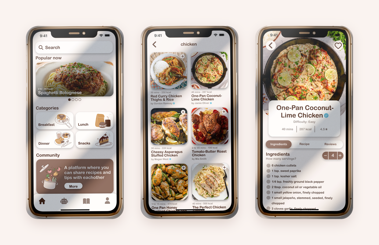
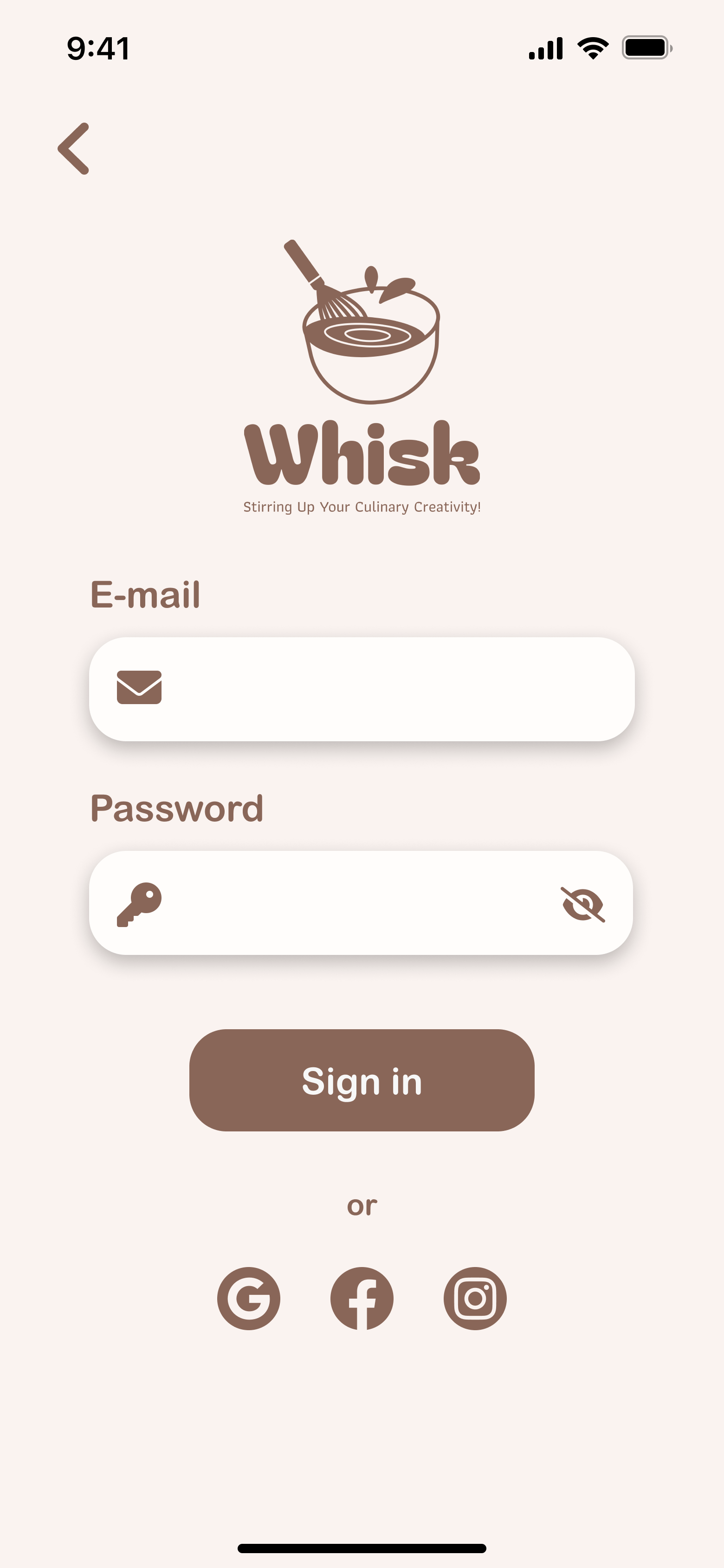
I mapped the main areas of the app before moving into UI design, including onboarding, home, recipe browsing and filtering, recipe details, weekly planning, shopping lists, saved recipes, profile, and settings.
- 01Onboarding
- 02Home
- 03Recipe browsing & filtering
- 04Recipe details
- 05Weekly planning
- 06Shopping lists
- 07Saved recipes
- 08Profile
- 09Settings
From research to product direction
Support everyday planning
The concept combined recipe discovery with meal planning and shopping support, so users could move from deciding what to eat to preparing for it in one flow.
A visual, approachable interface
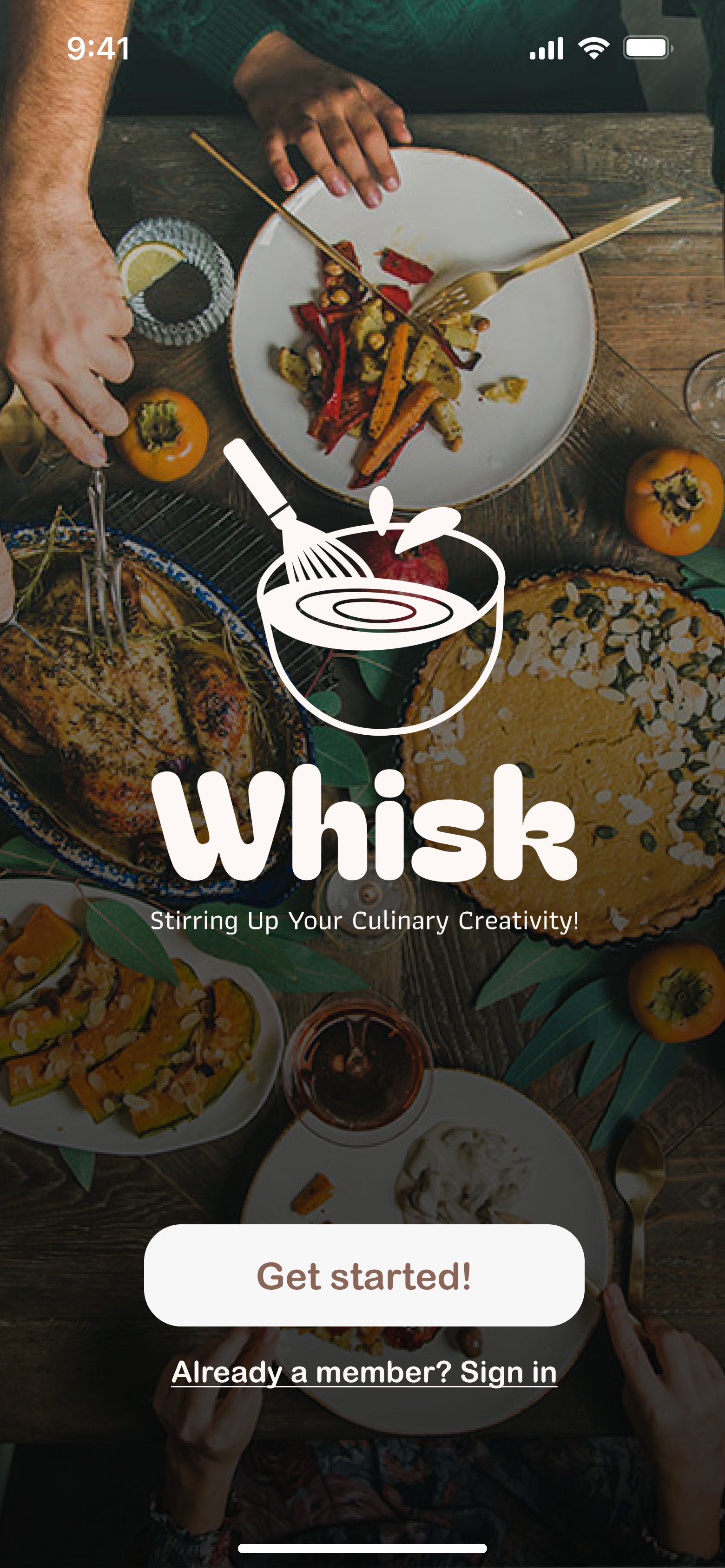
The UI used warm food imagery, soft cards, rounded shapes, and a restrained brown-and-cream palette to make the experience feel friendly and easy to navigate.
Personalization around real routines
The app concept explored dietary preferences, recipe filtering, weekly menu planning, shopping lists, saved recipes, leftovers, and other tools connected to everyday eating habits.
From UX into interface design
In the second semester, I translated the UX foundation into mobile UI screens. This was my first larger project, so I include it as an early snapshot of how I learned to connect research, structure, and visual design.
- Research gave the interface a clearer structure before visual decisions began
- Personas and journey maps helped connect broad user needs to concrete app features
- Mobile hierarchy and spacing became just as important as the visual style
- The project showed me how much stronger a concept becomes when UX and UI are developed as one process
Where my process started
Whisk is an early university project, but it was the first time I worked through a fuller UX/UI process across research, personas, journey mapping, product structure, and interface design. I keep it in my portfolio because it shows where that way of thinking started.