Health · Mobile concept
GlucoBuddy

A mobile companion that helps people with Type 1 diabetes understand their data, not just record it.
- UX/UI case study
- Diploma project
- 2026
- Mobile app concept
- Role
- Sole UX/UI Designer
- Team
- Solo project, with feedback from two mentors
- Scope
- User and medical research, journey mapping, information architecture, user flows, wireframing, UI design, prototyping, usability testing
- Status
- Clickable, usability-tested prototype
The challenge
Managing Type 1 diabetes often means switching between separate devices, apps and calculators while continuously interpreting glucose, insulin, food and lifestyle data. Existing tools are good at recording numbers, but the interpretation — what is happening, why, and what to do next — is still left entirely to the user.
Design question
How might we reduce this mental burden without taking control away from the user?
What research revealed
- survey responses
- 62survey responses
- interviews
- 5interviews
- competitors analyzed
- 7competitors analyzed
- expert interview
- 1expert interview
- 01
Data was fragmented
Users managed related information across different apps, devices and mental calculations.
- 02
Interpretation was the real burden
Recording values was manageable. Understanding why something happened, and what to do next, was not.
- 03
Support, not automation
Contextual suggestions were welcome, but the reasoning had to be visible and the final decision had to stay with the user.
- 04
One setup didn’t fit everyone
Users had different routines, experience levels and priorities, so they needed control over what information they saw and how the app supported them.
“Always being ready, paying attention, making countless decisions every day.”
“There is no break.”
“If everything is in separate apps, it becomes impossible to keep track of.”
“It could give suggestions based on events and values, but it shouldn’t act without me.”
From research to product structure
Experienced pump user
More experienced and analytical, with a stronger need for control, deeper explanations and access to detailed information.
Understand the domain
Before designing the interface, I studied Type 1 diabetes management, insulin therapy, diabetes technologies and the safety boundaries of digital decision support.
Synthesize the research
Based on the research and user interviews, I created two behavior-based personas representing different experience levels, routines and needs. Their differences helped clarify how much reassurance, explanation and control the product needed to provide.
From personas to product structure
Scenario 1
Nighttime correction
Deciding whether to correct, wait, eat or investigate a potential device issue while tired and under pressure.
Scenario 2
Unexpected food situation
Estimating carbohydrates and insulin without reliable nutrition information.
I mapped two situations where uncertainty and cognitive load were especially high. These scenarios helped define the product priorities and the five-part structure of the application: Home, Diary, Add, Recipes and Profile.
From insight to design
The research was useful only if it changed the product. These were three of the clearest links between what I learned and what I designed.
Numbers arrived without context
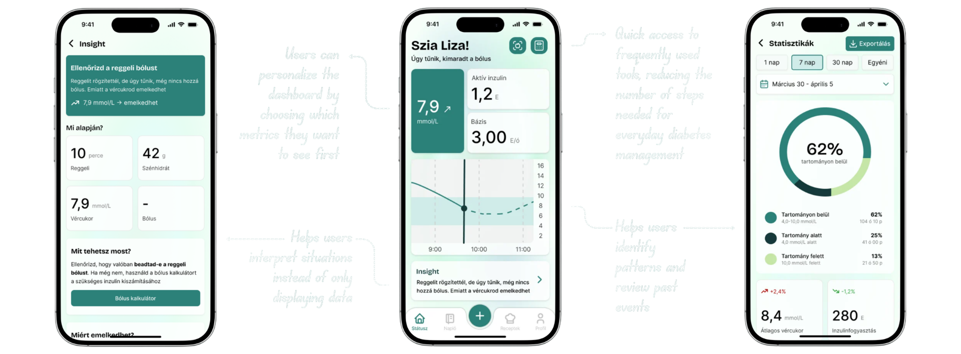
A dashboard that pairs current values and trends with a plain-language explanation of what may be behind them.
Related information lived in separate apps and devices
Unite related health and lifestyle data in one chronological view, making patterns and connections easier to understand.
Support was welcome, control was non-negotiable
Recommendations that always show their reasoning and can be manually adjusted before anything is accepted.
Testing & iteration
I created more than 40 wireframe screens to explore the product structure, key flows and information hierarchy before moving into final UI.
I then tested the interactive prototype across the dashboard, logging, statistics and recipe-management flows. The overall structure worked well, while feedback revealed opportunities to improve explanation, control and readability.
What changed after testing
Insights explained too little
a dedicated details view for every insight
Suggestions felt too fixed
manual bolus adjustment before confirming
Ingredient data was too vague
glycemic index and brand-level information
Small text slowed reading
stronger hierarchy and larger mobile type
Final concept
The final concept was organized around five core areas covering users’ most frequent diabetes-management tasks.
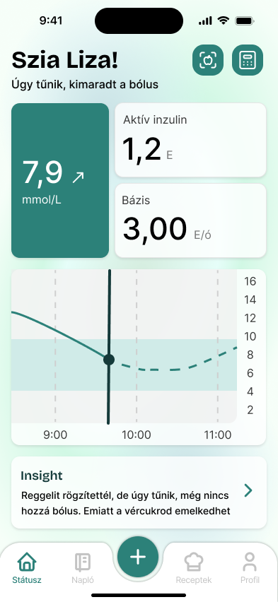
Understand the current situation
The dashboard combines current values, trends and contextual insights so users can better understand what may be happening, not just see another graph.
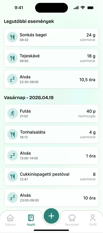
Log everyday events in one place
Meals, activity, sleep, medication and diabetes events connect in one timeline, reducing fragmentation and supporting later pattern recognition.
one timeline, not five apps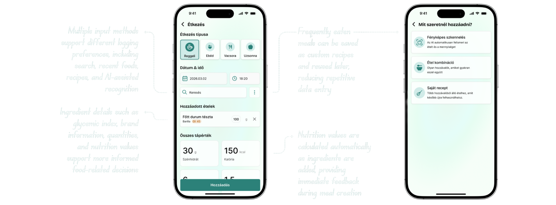
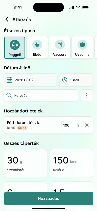
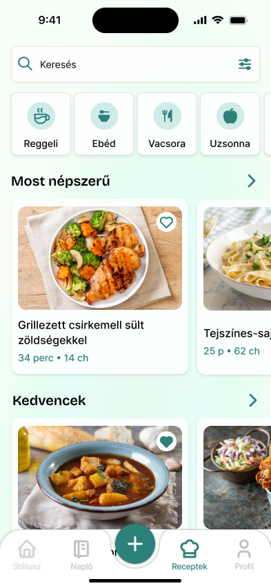
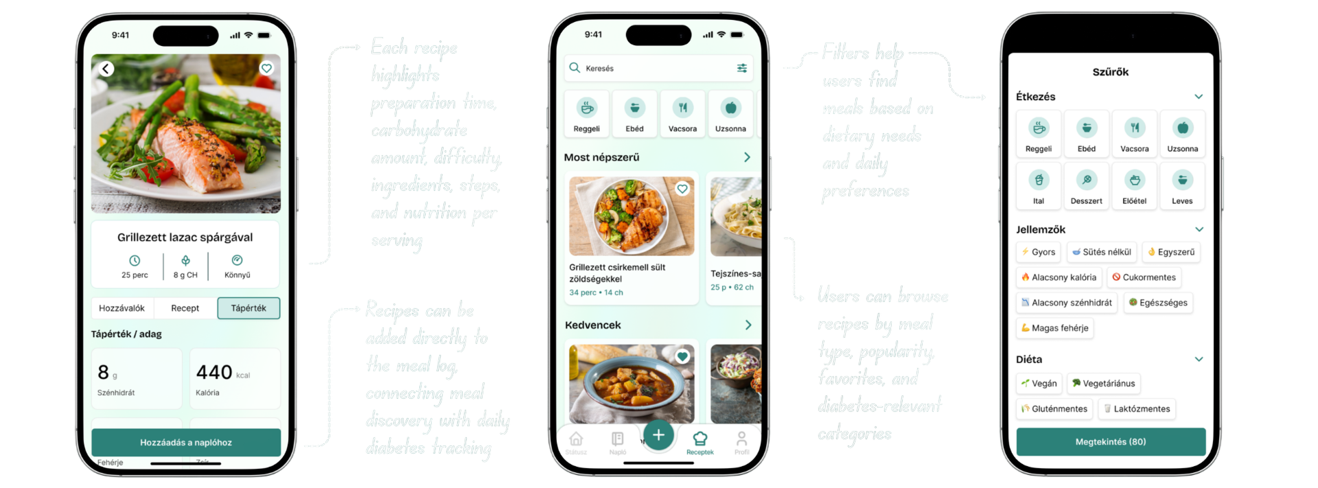
Make food decisions easier
Recipes connect directly to meal logging, while ingredient details such as glycemic index, brand and nutrition information make food decisions clearer and easier to manage.
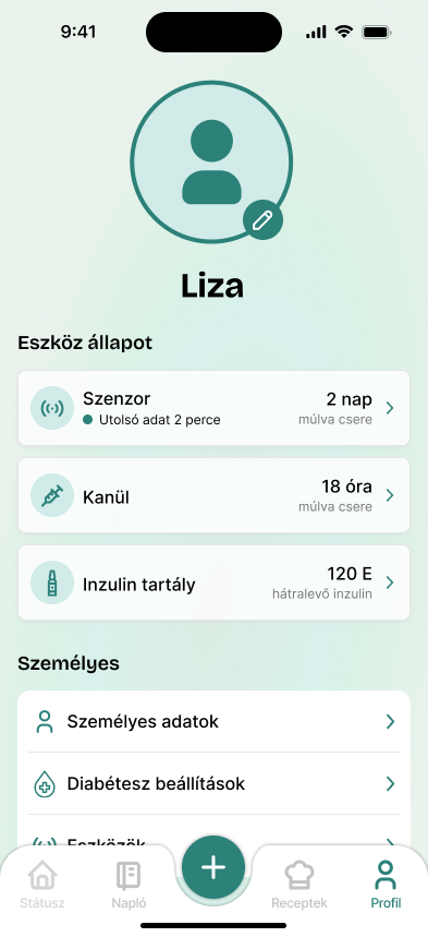
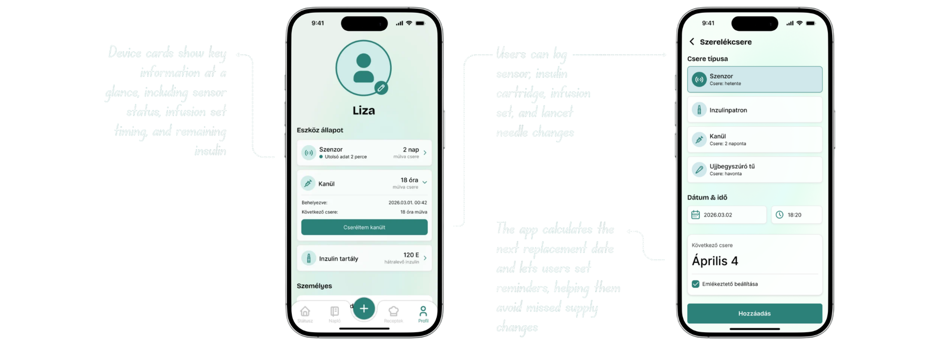
Keep device management under control
Device status and replacement reminders help users keep track of recurring sensor, infusion-set and supply changes without relying on memory.
Outcome
What I learned
Good design can make complexity feel manageable.
One of the most important lessons from this project was that UX design is not only about usability or aesthetics. In complex situations, design can provide meaningful support by making information clearer, more transparent and less mentally demanding.
Users did not need more information. They needed a calm, controllable experience that helped them understand the connections between their data.
GlucoBuddy became a diabetes management companion that brings glucose data, insulin information, food logging, lifestyle events, recipes, device status and contextual insights into one connected system. Instead of focusing only on tracking, the final concept helps users understand their current situation and access the most important tools from one place.
Next steps
Expand the product
Wireframe more key flows and define more of the system beyond the current prototype.
Explore personalization
Develop dashboard customization, notification behaviour and personalized settings in more detail.
Validate further
Test the broader concept with additional users and medical professionals, then refine the decision-support features based on their feedback.
Conceptual diploma project · Not a launched or medically approved product