Live product · Web platform
Cakes & Days
Expanding and refining a live birthday calendar product.
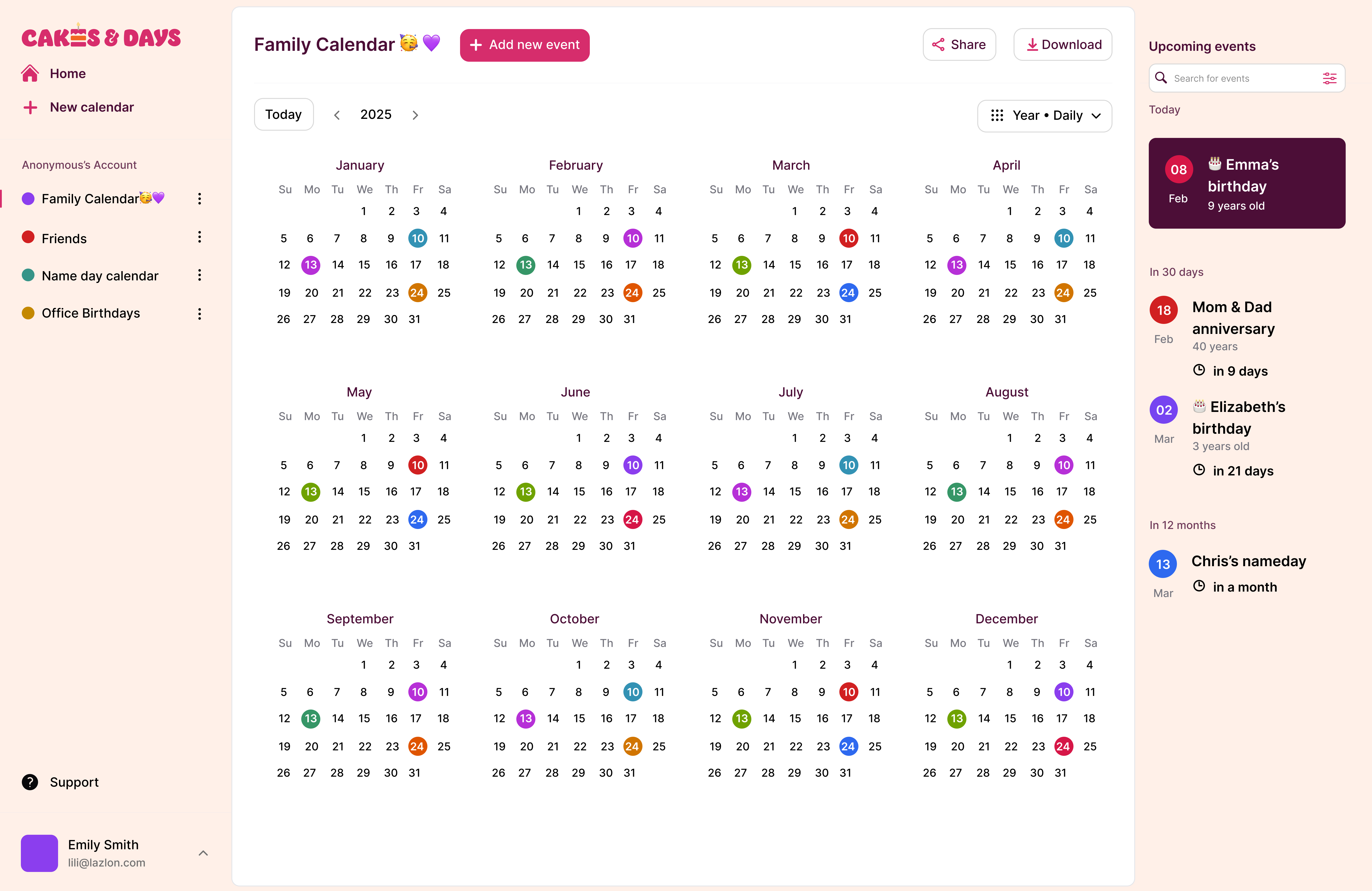
- Role
- Sole UX/UI Designer
- Team
- Product Owner, Full Stack Developer, Digital Marketing Associate
- Scope
- User research, user flows, wireframing, prototyping, UI design, usability testing, visual identity, developer handoff
- Status
- Live product
The starting point
When I joined Cakes & Days, the core calendar concept already existed, but the product had not yet launched. Its interface relied on a generic template, the brand was not established, and several important journeys still needed to be designed or refined.
My work focused on giving the product a recognizable identity and designing clear workflows as its scope expanded.
Design question
How could we give an early calendar product a clear identity and room to grow, while keeping it easy to use?
My contribution
Brand & interface
Identity and UI foundations
- Visual identity and logo
- Product UX and UI
- Reusable interface patterns
- Marketing website and email templates
Journeys
Simple tasks to complex workflows
- Flows including onboarding and calendar creation
- Subscription, settings, sharing and export experiences
- Complex creation and customization workflows
Craft & delivery
Testing and implementation
- Prototyping and usability testing
- Developer collaboration and handoff
- Implementation review and iteration
Creating a recognizable product identity
The original interface was functional but visually generic. I created the Cakes & Days logo and developed its typography, colors and interface patterns into a more coherent visual identity.
I carried that identity across the product and marketing website, creating a consistent experience from the first customer touchpoint to the live platform. I also designed a dark mode around deep purple surfaces, considering hierarchy and readability alongside the product’s playful character.
Designing connected user journeys
A significant part of my work involved designing complete journeys rather than isolated screens. I considered how people moved through the growing product and how its different actions, features and touchpoints connected into one coherent experience.
A guided entry into calendar creation
Creating a calendar is the product’s core action, but it can be unfamiliar to first-time users. I designed a guided wizard that introduces the process step by step: choosing a format, adding people and events, selecting a visual style, then deciding how the calendar will be shared or printed.
Rather than simply collecting inputs, it gives users a clear path through the creation process and a clear sense of progress as their calendar takes shape.
Working closely from idea to implementation
As the only designer in a small team, collaboration was part of the work from the beginning. I shared designs while they were in progress, discussed feasibility before directions were final, and stayed involved as ideas moved into the live product.
Share work while it is developing
I brought designs into regular discussions with the product owner and developer, so questions could be addressed before the direction became too detailed.
Discuss feasibility early
I worked with the developer to understand implementation constraints and explore alternatives that preserved the purpose of the design.
Follow through on implementation
My involvement continued through handoff and implementation review, with feedback on how the designs translated into the product.
Extending the identity beyond the product
I also designed the Cakes & Days marketing website from the ground up, including the homepage, feature pages, team page and blog experience. I created email templates as well, helping the visual identity remain consistent across the wider customer journey.
one identity, everywhereComplex workflows, beyond what’s live
Alongside the public experience, I have also worked on more complex creation, personalization and gifting journeys. They are still evolving, so I cannot show their detailed flows publicly, but they required thinking through many interconnected decisions, states and user needs.
In progress
Flexible creation tools
Designing ways for people to personalize a calendar or printable design at different levels of depth, from quick visual changes to more detailed control.
In progress
Personalized messages
Designing a guided experience for creating personal messages, with preference-based choices and refinement controls that keep the process approachable.
In progress
Digital gifting and sharing
Designing journeys around turning a finished creation into a personal digital moment: preparing it, sharing it and making the recipient experience feel considered.
A live product that continues to evolve.
During my involvement, Cakes & Days developed from an early template-based calendar into a live product with a recognizable identity and connected experiences across creation, management, sharing and communication.
Much of my work is already live, while other, more complex product areas are still in development and therefore represented here at a higher level.
Back to selected workWhat I learned
Ownership means staying involved beyond the design.
Being the only designer taught me to move work forward independently while keeping the product owner and developer involved. Explaining decisions, testing assumptions and discussing feasibility were as much part of my role as creating the screens.
A strong idea also needs to work for users, fit the product and hold up in implementation.
Explore the live product
Cakes & Days
cakesanddays.com